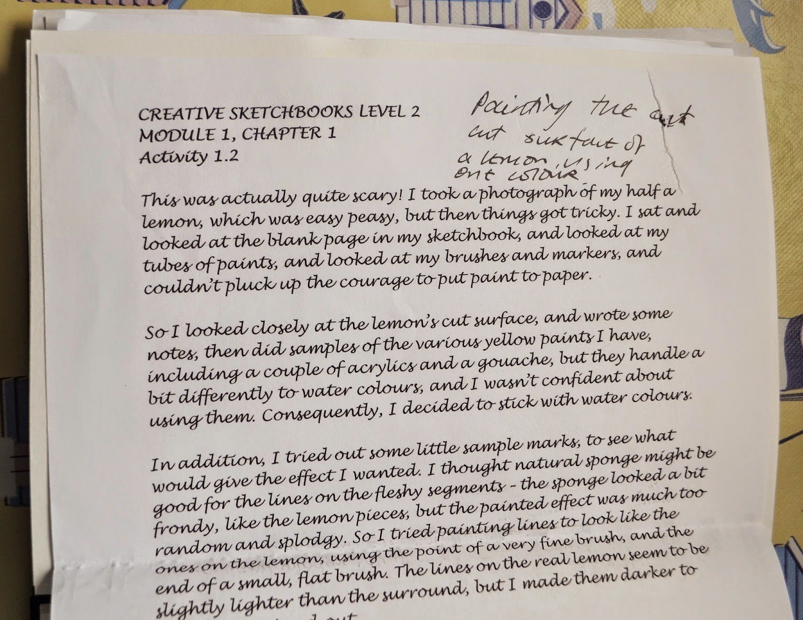
Creative Sketchbooks
Module 1, Chapter 1Activity 1.3
Combine two Primary
Colours to create a range of secondary colours
Oh
wow, what I can say about this... I loved, loved, loved mixing colours... This
was absolutely magical, like a form of alchemy - you take a colour, add a
second, mix well and, abracadabra, you’ve transformed them into something
different. Keep adding the second colour, drip by drip, and you create the
hugest range of colours imaginable. And
there’s even more variation, depending, for example, on which tube of blue you
select: ultramarine mixed with lemon yellow gives a different colour to ceruleum
mixed with the same yellow. Dark and light colours give quite different
results, as do cool and warm.

Do all these new colours have names I wonder? Or could I give them names myself?
I
played around a little with mixing colours for my wall, when I did the
Embroidery Taster Module, but nothing on this scale. At that point I was
inspired by Paul Klee, because I love his work, and I’d been to see the
exhibition at Tate Modern, which was amazing. At the moment I’ve got pictures
of some of my favourites pinned up on my ‘Ideas Board’. I keep looking at the
gradations of colour in his paintings and wondering: “How did he do that?”

I'm
not absolutely sure if there are recommended tools for adding and mixing colours
- I tried cotton wool buds (hopeless, they soak the paint up); cocktail sticks
and lollypop sticks, which weren’t too bad; straws, which were a bit unwieldy; and
a children's paintbrush, which was the best of all, so that’s what I used.
I
was looking for gentle transitions of colour, but I didn’t always achieve it –
it was tricky controlling the drops of paint, and my colours were a bit
unpredictable. Sometimes I didn’t add enough colour, so there was virtually no
change, and sometimes I overdid it, and the change was quite startling, but I
got better as I went along. However, I’m not sure I could reproduce the colours
I made, although I suppose they act as a kind of pattern, because as long as
you keep notes on what you do, you should be able to match the colours. That’s
the theory anyway! I forget to make proper notes on some bits, but I should be
able to work it out, because I can check the base colours with tubes of paint.

So,
Note to Self for future... Always keep a record of what you've done, however rough itmay
be, because you won’t remember it later on, and this is what happens....

I think I was playing around with madder and lemon yellow, and white... but maybe it was something completely different. So, I shall get my paints out, and hold them against the sample, and see which ones look the most similar!
And another Note to Self... Keep cleaning your painting brush thoroughly as you go along, because if you don’t it can affect your new colour. And lots of clean water is essential – dirty water affects the colours as well.