Pages

Monday 13 October 2014

More Layers...


Creative Sketchbooks, Module 1,
Chapter 5,
Extra Activity

Repeat the previous design with a pile of three or four layers.

Cutting layers for design

I think this design is overcomplicated! I liked the roots at the bottom of the spring onions, and the negative space between them, but I don’t think it lent itself to being layered, and because the pieces didn’t link together I got into a bit of a muddle with my layers. Not one of my greatest successes.


Cutting Layers

Creative Sketchbooks, Module 1,
Chapter 5,
Activity 5.2.

Cutting layers for design


The idea here is that you select a photo or picture, and trace it, and
trace the design, simplifying it if necessary. Then take two pieces of decorated paper, and the tracing, clip them together with paperclips (with the tracing paper on top), and cut the layers out. Place the pieces on top of another piece of decorated paper and remove the tracing paper. Then remove some pieces from the decorated cut-outs to reveal the layers beneath. You can reveal the middle cut layer, or the uncut base layer. Keep playing around with the design, recording your work with photographs, until you have something you like, and retain that one.

I worked with a photo of pumpkins, cut from a battered charity shop gardening book, and it looked simple, but I think the shape of the basket confused things. The base paper was blue and purple poster paint with alcohol splodges; one pattern was yellow and purple stripes merging into each other, and the other was a tube of orange acrylic.

I enjoyed trying out different arrangements, but I'm not sure it panned out as I expected. don’t think the papers go together. And the pumpkins have become quite unrecognisable – it’s strange that some things are recognisable from their shape alone (like an apple), while others need colour to identify them. Anyway, below are some of the  cut-out arrangements I created. Actually, I like this one better than the one I stuck in this book, especially as the design included a shape on the uncut bottom layer. I even had it balanced on the book when I took the photo, so I must have liked it, and I don't know why I didn't go back and recreate this one. An error of judgement on my part I think.


And some more...


Sunday 12 October 2014

Cut-Out Apples

Creative Sketchbooks, Module 1,
Chapter 5,
Activity 5.1.

Create a design by cutting a shape into segments.


This was fabulous -I was a bit wary of chopping up my decorated papers, because they look so wonderful, and I enjoyed making them so much, but when I sat back and looked at my cut-out shapes I thought they were really effective, and they pleased me more than anything else I’ve done so far. I like the way this distorts the apple, and you have the solid cut-out shapes , but better still there are patterns in the empty spaces (are these negative spaces?), which were quite unintentional on my part - it sounds silly, but they really took me by surprise. I particularly like those sinuous curves of the green space on the first red apple in the second row.

I chose my apple from earlier chapters for my shape, and just chopped it up and re-arranged the pieces as the mood took me. The paper for the first piece was photographic paper, rollered with blue and purple ink, then overpainted when dry with red acrylic, which was marked with a fork while wet, so the ink showed through (but you can’t see the colours properly in the scanned image). I tried the shapes on various sheets of decorated paper, but none of them did anything for my cut-out red apples, so I thought of the complementary colours I studied back in Chapter 2, and stuck them on some bright, plain, green paper, which isn’t what I was meant to do, but I think it looks good.

The second piece of paper was thinnish cartridge paper, painted with watery powder paint, which was scattered with salt crystals and the apples were cut from sugar paper which had been painted with wiggly acrylic lines.

Matisse Cut-Outs


Creative Sketchbook, Module 1,
Chapter 5
An Additional Activity – A Visit to the Matisse Cut-Outs

This is a prequel to ‘Finding Out About Henri Matisse’ in Chapter 8, because I’ve been to see the Cut-Outs Exhibition at Tate Modern, and Chapter Five is all about Cut-Outs

I’ve never been the greatest fan of Matisse. That’s not to say I dislike him, but I wouldn’t stick a postcard of his work on the wall. However, since I have to do a bit of research on him for this course, and since ‘Henry Matisse: The Cut-outs’ is the current major exhibition at Tate Modern, and since my Younger Daughter lives in London, what better way to spend a day than to mooch around the gallery and meet up with YD! 
 
And I’m awfully glad I did, because the exhibition was quite awesome. I was quite unprepared for the scale of the cut-outs – many of them are huge, and the vibrant colours, the shapes, and the sense of movement are stunning.

I came away converted. Not only do I begin to understand a little about some of Matisse’s work, but I like it, and I can see how it relates to what we are doing. His use of colour and shape, negative and positive space and so on was very inspiring, and it was interesting to see how he worked – there were a couple of short films, showing how he wielded the most enormous pair of shears, ‘cutting into colour’ as he himself described it.

 In the films he cut freehand, producing wonderfully fluid shapes, but I gather that sometimes he did draw an outline on the paper. And, in case you’re wondering (well, I certainly did), he had an array of scissors in various sizes. So presumably he used smaller ones for the more detailed and intricate work.

I hadn’t realised that for the last 17 years of his life (he died in 1954) Matisse was confined to a wheelchair and was unable to paint, so he turned to paper cutting to express his ideas. It was a technique he had used on occasions in the past to create drafts of his paintings, but he took it to a whole new level. He cut shapes from paper painted by his assistants, who used gouache, producing a flat, even colour, with no shading. The colours were selected by Matisse – he had sample squares prepared to show exactly what he wanted. The assistants lightly pinned the cut-out pieces of paper to the walls of Matisse’s studio, leaving them free to move in the wind. Bits were added, taken away, altered and moved until Matisse was satisfied with the composition, and it was finally stuck on paper, canvas or board.
 
When you look at the pictures they are so seamless it’s hard to remember they are created from pieces of paper – in fact, I’d always assumed things like Blue Nude and The Snail, which are among his most iconic images, were painted.  

The Snail
 A lot of the shapes turn up over and over again in different pictures, in different colours, set against different coloured backgrounds. Those flowing leaves, looking like fronds of seaweed, seem to be a favourite, and so are the little heart shapes, which could be fruit or leaves or flowers. The shapes are there on their own, joined and overlapped and layered. Sometimes bits of a shape are repeated, enlarged or made smaller, and sometimes it’s the negative shape which seems to the focal point.  

Then there are the human figures, reduced to their simplest form, but it’s a deceptive simplicity, because these are the stars of circus and stage, acrobats and dancers, swooping and leaping with joy. How can anyone convey movement and energy in just a few flowing blocks of colour? 

And such colours! They are amazing: bold, bright, loud, and pure, they sing and shout from their paper settings, demanding attention. My personal preference has always been for a more muted palette, with shades of pale, harmonious colours (you won’t find anything bright or clashing in my house or wardrobe). I should be well out of my comfort zone at this exhibition (even more so when you consider that on the whole I tend to like paintings that look like what they are meant to be). But I love it! It’s one of those ‘wow’ moments when something I’ve never understood suddenly starts to make sense, and I can enjoy it. 
 
 
Having read this through, it strikes me that it’s less about Matisse, and more about my response to the Cut-outs, and somewhat jumbled at that. But I came away with so many thoughts and images buzzing around inside my head it’s hard to know where to start, and how to put things in any kind of cohesive order, so I hope a little of my enthusiasm comes across. And in this piece I haven’t mentioned his painting… I’ve left that for chapter 8, because the more I find out about Matisse, and more I look at his work, the more interested I get, and the more I like him. He was constantly evolving and trying new techniques, and new ways of looking at things, but he never saw himself as a revolutionary. 

He believed exactitude in art was not important. He stressed that when he painted grass it was not real grass. Like Cezanne, who tried to create the essence of what he was painting, rather than an exact replica, Matisse felt it was the emotion of the thing that mattered. “I simply try to use colours that express my feelings,” he explained. 

He sought the strongest colour effect possible, claiming that colour ‘contributes to the expression of light’, and that it is a ‘liberation’.  I think it was that freedom which enabled him to embrace cut-outs so whole-heartedly and so successfully when he was old and ill, and to abandon any remaining shreds of traditional brush and paint methods. His figures, in particular, are pared down and simplified – not quite abstract, but definitely a logical progression from his controversial ‘Dancer’ paintings.
 
Icarus Falling

When talking about his cut-out figures Matisse said: “One mark is enough to evoke a face. There is no need to impose eyes or a mouth on people – you should leave the way clear for the spectator’s daydreams.”

And I think that’s a pretty good ambition, to engage the viewer and draw them into the picture, and make them think about it, and create their own story about what it represents, I could have stood and daydreamed for hours in front of any one of the 120 pictures in this exhibition.
 
(All Information is from the Tate website).

Coloured Papers

 
Creative Sketchbook, Module 1
Chapter 4,
Activity 4.1, 4.2, 4.3 and Extra Activities

Make decorative coloured papers using paint.
 
Somehow, as I worked, one thing led to another, and I didn’t separate out the various activities in this chapter, but you can see from the photos that I have covered them.

I scanned in the pages, but the text is difficult to read, so I've pasted it after all the pages. There are a few changes here and there between the sketchbook.


Right, this chapter was just what I needed - a real morale booster! It was fabulous, and I have had such fun, and enjoyed it so much, fiddling around with paper and paints and implements to make marks with paint…Or in paint!  I’ve followed the suggestions in the course booklet, and experimented with my own ideas (not always successfully, but there were far more good moments than bad).
Somehow, as I worked, one thing led to another, and I didn’t separate out the various activities in this chapter, but you can see from the photos that I have covered them. I have my decorated sheets of paper tucked away in a box, and there are far too many to show them all, so I’ve tried to squeeze as many as possible into photographs, to give some idea of what I’ve been doing, as well as showing pictures of some individual sheets. And I’ve written this as a kind of overview, rather than producing notes about every patterned sheet of paper.
In a bid to keep some kind of record, I tried to remember to number each piece of paper, then wrote the number and method on a large label, and stuck that on the back.
Paints
As far as paints go, I was reluctant to use my rapidly dwindling stock of watercolours, so I raided a bag of acrylics among the stash of arty goodies abandoned by my Elder Daughter when she left home. The hoard included some huge plastic tubes of cheap acrylics in all sorts of colours, as well as a range of colours in the usual small tubes. I’ve never really used acrylics before (apart from my disastrous experiment in Activity in 2.3) so it was a good opportunity to see how they handle. The big tubes seemed to be thinner than the small ones, and they were ideal for covering A4 sheets of paper. They were quick drying and could be used thick (straight from the tubes), or thinned down with water. They lack the transparent quality of watercolour, but they mix and merge OK, and thinned down they drip well, and give interesting effects on the paper. On some papers (shiny, non-porous) thick acrylics can be moved around to create patterns in the paint, and you can get textured effects by dragging implements across the surface.
I bought a set of little pots of children’s poster paints (because I felt nostalgic after mentioning them in the last chapter). And, still on a Memory Lane trip, I went online and ordered some powder paints. I hadn’t used either of these since I was a mum helper in my daughters’ school  some 20 years ago, and I’d forgotten how incredibly messy they can be, but they clean up OK with soap and water. People are always a bit dismissive of these paints, because they’re seen as being ‘just for children’ but in actual fact they are brilliant for this sort of project (and they’re dead cheap, which is an advantage) and I loved working with them. I doubt you could produce fine or subtle effects, but they provide good cover, and can be used with all kinds of other paints, inks and markers. Like the acrylics, poster paints can be used just as they are, or thinned down with water, and they mix and merge and drip and streak and splodge and splatter and spatter and smudge quite beautifully, and give textured effects. Powder paints give the same sort of effects when mixed - plus some! Dry powder can be sieved, dropped, dragged or even blown or spattered across a wet or damp surface, and you can apply on to dry paper, then spray water over it.
Inks
I’ve never really used inks before either (other than in my fountain pen, and inked pads for rubber stamping), but I succumbed to a box of Brusho powders at the embroidery exhibition at the NEC earlier this year – then got home and was too nervous to use them! So I mixed some up, and experimented. I discovered a very little powder goes a very long way, so I’m storing left-overs in foil-covered jam jars.  These don’t seem to merge together to form other colours like paints do, and they are too thin to produce textured effects, but they are just fabulous brushed or rollered over textured paints, or other markers, because they are wonderfully transparent. And you can get incredible effects with them, with a roller, on glossy paper.
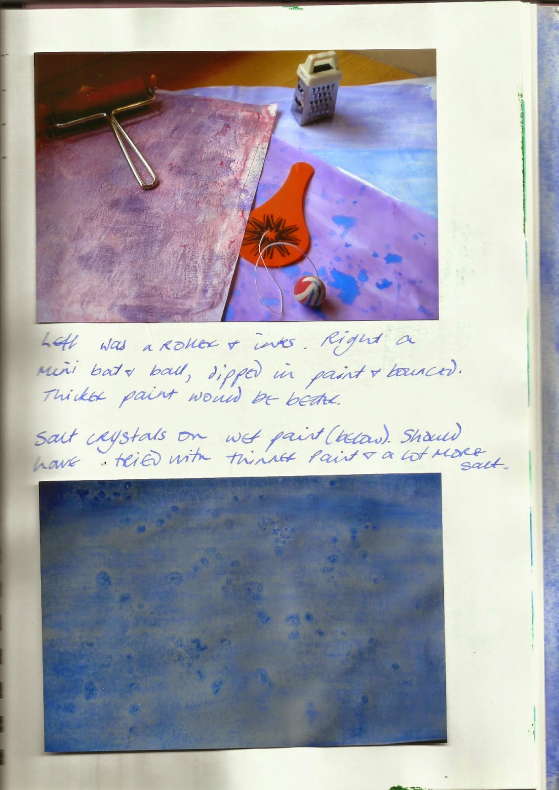
Brushes/Applicators
I mainly used household decorating brushes  for covering pages with water, paint, ink etc, and children’s nylon brushes  (round and flat, in a variety of sizes) for adding details for patterns. I tried using a sponge roller, as suggested in the course book, but was not impressed. I got much better results with a children’s plastic rolling pin intended for modelling dough, and a Brayer look-alike which is fantastic (bit tricky to clean though), as was  a narrow plastic roller that’s meant to flatten the edges of wallpaper joins! And I found plastic tools which children use to make marks in modelling dough are great for making marks in paint. Then there were various bits and bits found around the house, including plastic knives and forks – and an old nit comb (I keep it as a good luck charm because I’m convinced if I throw it out we’ll be infested with headlice again!).
Markers
I was going to try using things like pastels, felt tips etc to make marks under layers of paint or ink, but only got round to using coloured chalk, which works best on dry paper, then water brushed over the paper, then ink or paint. And little tea lights are good for wax resist marks. And the kind of glass paints which you paint on to glass, then peel off when dry, can be used to paint a pattern, then painted or inked over (but don’t peel them off).
Other Things
I loved the patterns produced by laying clingfilm on wet paint, so I had a go with tin foil, which is every bit as wonderful. And I had a small piece of large bubble wrap, so I laid that over wet paint (bubble side down) and just loved the results – but it works best with some kind of weight on the top (I used a box of paper). There was a jar of gesso among my Elder Daughter’s old art stuff, so I painted that on some heavyish cartridge paper, made textured marks  with the nit comb, left it to dry, then brushed  blue ink over, and then purple. I loved the result so much I tried mixing paint with gesso, and made marks using the blade of a plastic knife with a serrated edge to. The pattern was great but, sadly, the gesso reduced the bright orange acrylic paint to a sickly shade of pale apricot. Better to use the gesso, let it dry, then apply paint over it I think
In addition to working on wet and dry paper, I’ve sprayed painted surfaces with plain water and salt water (I love this), as well as using a little rubber-topped dropper to drop salt water on surfaces (fantastic), and bleach (total disaster – I made the mistake of trying to blob drops of liquid on a painted surface from the nozzle on the container, and it went everywhere). Best of all was alcohol!  I read something which said alcohol brushed on as you paint makes wonderful effects, and so it does…  Colours change as they bleed into each other, and some areas fade while others darken, and you get bubbles and stars and fuzzy edges and all sorts of things. I assume you really need a pure alcohol, but I used Southern Comfort, because that’s my favoured tipple. I couldn’t get the hang of using it with a brush, but the dropper was brilliant, and it spatters nicely, and you can dip things into it and drag them across the paint. I had planned on drinking the remaining Southern Comfort, but despite my best endeavours paint got into it, and it ended up a kind of greenish khaki (bit like my efforts at making grey) which does seem to be a waste of good alcohol, but never mind. Oh, I nearly forgot, I had a go at ‘distressing’ photographic paper (before I painted it), with a nutmeg grater. And with a ‘wet and dry’ sanding block.
Paper
I used various kinds of paper, including sugar paper, photographic paper, various weights of panting paper, printer paper, plus some odd sheets from ED’s stuff that I can’t identify at all! Some curled quite badly (especially the thinner and cheaper papers), probably due to the vast quantities of water that I used.
Some things I left to dry flat, while others were pegged on an old clothes airer to drip dry!


Monochrome


Creative Sketchbook, Module 1
Chapter 2
Extra Activity
 
Monochrome painting with a colour.

 
I didn’t get this far. But I will go back this chapter. Honestly.


More Shades of Grey!


Creative Sketch Book, Module 1
Chapter 3,
Activity 3.2

Make a composition in monochrome using a photograph.

Given the problems I had creating greys, this was never going to be an easy task, and things just seemed to go from bad to worse. I selected a photo of little plum tomatoes, taken in Birmingham Market, because out of the various photos I took (the stallholders thought I was nuts) this had the best highlights, and simple shapes. I marked off a section which had a clear definition between light and dark, and traced it into my sketchbook, and tried painting it, with disastrous results. I couldn’t get a colour I was happy with, and I couldn’t get it pale enough, and the white wax crayon I used on the areas of light didn’t act as a ‘resist’ at all, so I tried painting around them, and everything went patchy, instead of being shaded…

And at this point I lost my confidence completely, and was so demoralised that I nearly gave up altogether, so I abandoned this chapter for the moment, otherwise I shall never get anything else done. But I will go back to it later.

 Having said that, it was interesting, especially after using blocks of colour in previous chapters. And I begin to see how using light and shade can make pictures appear three-dimensional.


Shades of Grey

Creative Sketchbook, Module 1
Chapter 3,
Activity 3.1

Use paint to make a range of different greys 

I've begun a new sketchbook, and I've upgraded myself to an A4 size, because I think the bigger pages will make for easier working. However, they are more awkward to photograph, so I'm scanning them in to the computer, and I'm sorry to say the reproduction is not brilliant. On the plus side they are straighter than my photos!

Anyway, I'll start by saying I found this really, really difficult, and I’m not sure why I got in such a mess with it. I loved mixing colours to tones, tints and shades, and creating new colours from the three primaries, but producing greys was a total nightmare, and I couldn’t get the hang of it all, apart from mixing black and white, which is simple.

But after that it was all downhill all the way. Mixing red, yellow and blue was a disaster, as was mixing two complementary colours and then adding white. Mostly, whatever I mixed, I ended up with the kind of nasty, dirty khaki that very small children produce by sloshing every different colours of poster paint on the paper and letting it all run together. 

With practice I progressed and produced… Colours! Browns, greens, purples, blues, all rather dull, with a greyish tinge maybe (if you look closely), but definitely not grey, as you can see below.
 
 
At this point I was so frustrated and disheartened I bought a tube of Payne’s Grey watercolour, and played around with that, adding water, to reassure myself that proper greys do exist:


Then it was back to the  mixing pots to try again, but when I did produce grey it was more by good luck than good management, and because I wasn’t organised, and didn’t keep proper notes to start with, I had no idea what I’d done, so I have these mystery cards:


So then I tried writing notes on the back of each card, but it’s difficult to write on one side when there is wet paint on the other. Finally, I made little samples, with splodges of paint and notes, like this:


And I tried to keep track of what I was doing by numbering the back of the cards before I started painting, and keeping a key as I went along. This was a better method of working, and in the end I did mix quite a number of greys, but I didn’t seem to be able to record the proportions of paint and water used in any meaningful way, and found it impossible to reproduce any of the colours. Whatever the reason, it was very annoying. 

To make matters worse, some of my greys looked fine when the paint was wet, but dried to a completely different colour, and sometimes as they dried the paint seemed to separate out into its constituent colours. I assume this was due to inadequate mixing, or not cleaning the brush properly.  

I haven’t got a good range of greys, but I did establish that mixing warm colours produces warm greys, while mixing cool colours makes cool greys, and you have greys with a blue tinge, green tinge, yellow tinge etc. Anyway, here is a photo of my painted grey cards:


Overall I felt very frustrated and disappointed with this exercise: the results were unpredictable, and I seemed to have no control over what was happening. It’s ironic really, because in Activity 2.3 I managed to produce grey without even trying! I feel really stupid and ignorant, and would welcome any advice on mixing greys!

Hidden Apples


Creative Sketchbook, Module 1
Chapter 2,
Extra Activity 2

Take your template and draw your shape several times on a page. Shapes can be overlapped or rotated or flipped. Divide page into a large grid. Spacing can be at right angles or with diagonals. Using complementary or analogous colours paint your pictures changing colour when you reach a grid line.


Complementary
I feel doomed on this chapter. Everything seems to have gone wrong, though this time it’s my own fault, because I didn’t read the instructions properly. I produced two lovely pictures (well, I like them) of overlapping apples, with each section painted in a different colour, and one is complementary (red/green) and the other is analogous (yellow green, yellow, yellow orange). So, spot the mistake… The grid is missing on both pictures. I can only sigh, reprimand myself for my own stupidity, and start again… I had such fun doing these as well! 


Analogous
 OK, here we are… Two practically perfect pictures (well, they meet the brief at any rate!). Actually, I think the first two were neater, and both the analogous compositions have a yellow that turned green when I added black (again), so they don’t look quite as harmonious as they should. But I like the reds and greens of the second complementary picture.  


Complementary
Analogous
And I’ve had every bit as much fun with my ‘do it agains’ as I did first time around. I really enjoyed this activity: I love the way it distorts the original image, so the colours and shapes are not what you expect, but when you look closely the apples are still there (more visible with the grid than without), camouflaged perhaps, but untouched and unblemished. It’s just a different way of looking things… A bit like life I guess.

More Apples...


Creative Sketchbook, Module 1
Chapter 2, Activity 2.3

Use analogous colours to paint harmonious patterns

 
First Attempt: Analogous colours are those in three adjoining sections of the colour wheel, so they share a base colour. I decided on red, red violet and violet – then, for some unknown reason, went ahead using red, violet and blue! What was I thinking?

And to make matters worse, I thought this would be a good opportunity to use acrylics instead of watercolours, because I thought they would like bright and vibrant, and suit this kind of pattern. However, it took a while getting used to them, because they are thicker than water colours, and dry very quickly. I found they were more difficult to mix than watercolours, and when creating tints and shades they seemed to need more white and black than I anticipated, and I didn’t always get the variation in colour that I wanted. As I went along I got better at gauging how wet the paintbrush should be, but the overall effect is a bit patchy. Actually, I quite like the patchy effect, and the colours… it’s just a shame they’re not analogous.  
 

Second Attempt: I tried this again, with watercolours (ultramarine and alizarin), hoping to produce red violet, violet and blue violet, but I lost the plot completely and have no idea where I went wrong… Instead of the colours I envisaged I got greys and a very dull brownish purple.


Third Time Lucky: Cracked it! I’m happier with this, apart from the fact that my yellow turned green when I added black to get a darker shade, and I only used a very, very small amount. I went back to the acrylics this time around, and mixed yellow and red, for orange, yellow orange, and yellow, and I watered them all down a little bit, with the teeniest amount of water, to make them easier to work with.
 

Op Art Apples


Creative Sketchbook, Module 1,

Chapter 2, Activity 2.2


Paint simple shapes with differing proportions of complementary colours to create optical colour mixing 

 
Many, many years ago, I had a black and white ‘op art’ dress in a squashed rectangle design, which looked uniformly grey from a distance, but made my eyes go googly if I looked at it too closely!  

I expected this exercise would produce a similar effect as far as colour concerned, but I don’t think it has. Nor do my paintings give any sense of movement like the ‘op art’ designs I remember from my youth. Perhaps I should have painted an apple with smaller shapes, but my eyes (by which I really mean the varifocals) aren’t up to coping with anything much smaller! I wish now I’d tried to experiment more with mixing different shapes and sizes, like I did on apple 3. It was an interesting activity, but I’m not sure I like it!

Warhol Apples Take Two...


Creative Sketchbook, Module 1
Chapter 2,
Extra Activity 1

Andy Warhol style repeating pattern of fruit/veg in pairs of complementary colours, using tints and shades in addition to hues

 
This carries the previous exercise forward a stage by introducing tints and shades, and I’m fascinated to see how complementary colours work together. I look at the colours I mix and am convinced they will clash, but once they're together they each seem to make the other look brighter. I couldn't live with that kind of design though. And my brushwork still needs attention.

Warhol Apples Take One...


Creative Sketchbook, Module 1,
Chapter 2,
Activity 2.1.

Andy Warhol style painting of fruit/veg

Complementary colours are the ‘pairs’ found on opposite sides of the colour wheel, eg yellow/purple, green/red, blue /orange. A primary colour is always opposite the secondary colour which doesn’t contain that primary colour, and complementary colours intensify each other.Using solid blocks of colour in this way made me feel like a small child again, filling in the pictures in a colouring book! I thought the patterns produced were very striking – I’d usually opt for something much less bold. It was fun to do (even if I don’t like Andy Warhol) and interesting to see just how vibrant complementary colours can look alongside each other.
 

However, it did seem to use a lot of paint (especially the green/red version, where I used the paints straight from the tubes).  And  my surface isn’t very uniform surface.


Notes to Self:

·         Never, ever, ever paint all around the edge of a shape, then try to infill, because it produces a nasty, hard line of paint which doesn’t blend in with the centre – presumably because it’s dried as you work!

·         Make sure you mix enough paint – I ran out of purple half-way through, and it was jolly difficult trying to match the colour and hide the ‘join’.

·         Painting a solid block of colour every which way looks messy. For the purposes of this exercise I guess it doesn’t matter, but for a proper painting it might.