Creative Sketchbook,
Module 1
Chapter 2, Activity
2.3
Use analogous colours
to paint harmonious patterns

First
Attempt:
Analogous colours are those in three adjoining sections of the colour wheel, so
they share a base colour. I decided on red, red violet and violet – then, for
some unknown reason, went ahead using red, violet and blue! What was I
thinking?
And
to make matters worse, I thought this would be a good opportunity to use
acrylics instead of watercolours, because I thought they would like bright and
vibrant, and suit this kind of pattern. However, it took a while getting used
to them, because they are thicker than water colours, and dry very quickly. I
found they were more difficult to mix than watercolours, and when creating
tints and shades they seemed to need more white and black than I anticipated,
and I didn’t always get the variation in colour that I wanted. As I went along
I got better at gauging how wet the paintbrush should be, but the overall
effect is a bit patchy. Actually,
I quite like the patchy effect, and the colours… it’s just a shame they’re not
analogous.
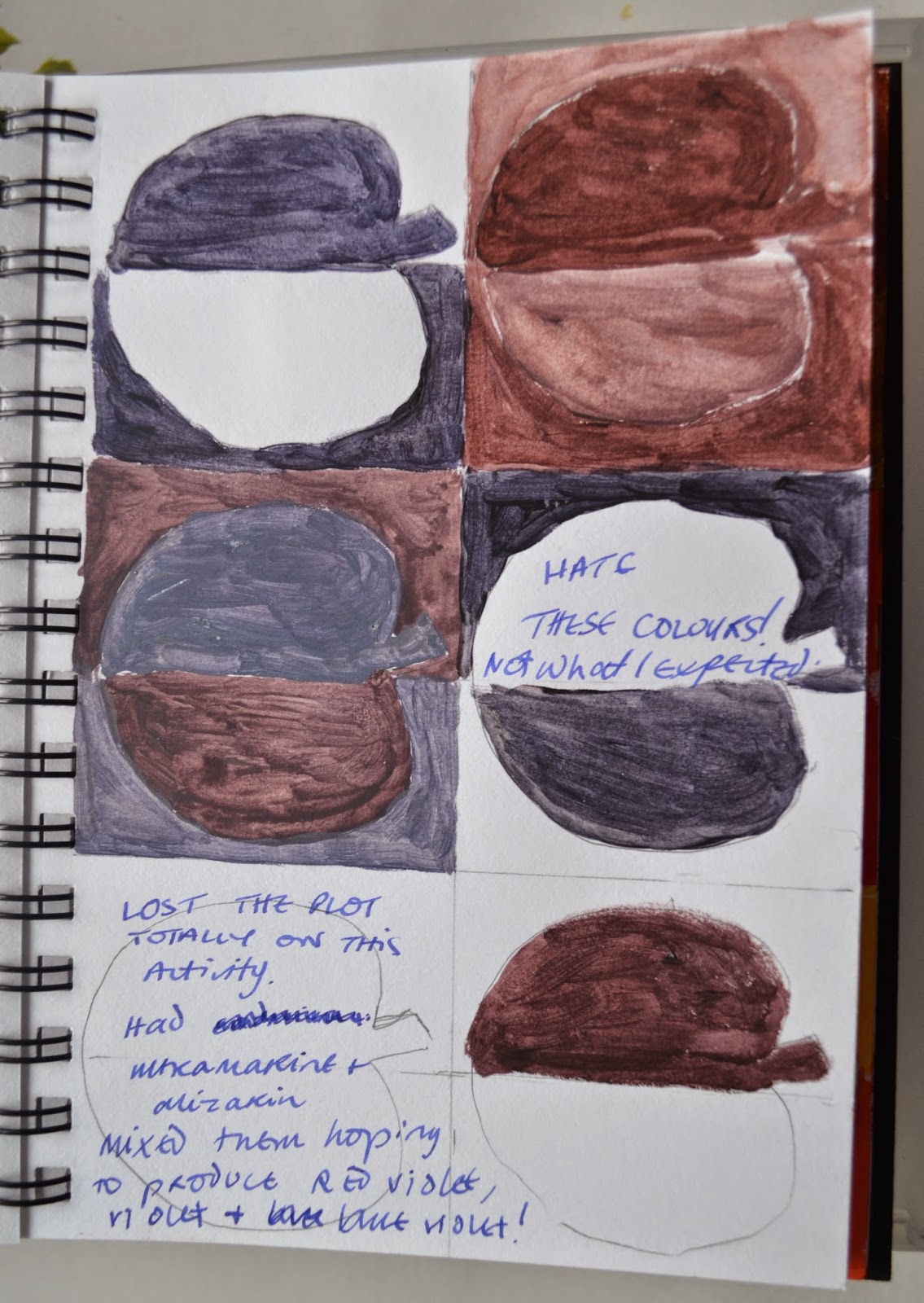
Second
Attempt:
I tried this again, with watercolours (ultramarine and alizarin), hoping to
produce red violet, violet and blue violet, but I lost the plot completely and
have no idea where I went wrong… Instead of the colours I envisaged I got greys
and a very dull brownish purple.

Third Time Lucky: Cracked it! I’m happier with this, apart from the fact that my yellow turned green when I added black to get a darker shade, and I only used a very, very small amount. I went back to the acrylics this time around, and mixed yellow and red, for orange, yellow orange, and yellow, and I watered them all down a little bit, with the teeniest amount of water, to make them easier to work with.
No comments:
Post a Comment